Project
Grocery List Feature
Role
UX Designer
Timeline
2024 – 3 months
ABOUT
This project focused on enhancing a grocery list feature within an ecommerce app. The goal was to improve product searchability, boost sales, and enhance user engagement. Through usability testing, I gathered insights and established a usability benchmark for the feature. My goal for this project was to develop a research plan, recruit participants, design user flows, moderate testing sessions, and analyze key insights.
Research Plan
I started this project by creating a project overview doc, identifying a project goal, and creating a research plan.
Project Goal
Gain a baseline understanding of how users interact with a grocery list feature on an ecommerce app
Research Method
Moderate a usability test to evaluate the effectiveness of the grocery list feature
Measure task completion time, number of successes, and errors
Evaluate overall user satisfaction
Recruitment
Posted a form to various online groups with a small reward for participating
Sent a follow-up with details of what to expect and schedule a time
Amount of participants limited due to a lack of responses
Participants
Recruited 5 participants to do usability testing
Wide range of acceptance criteria due to the universal nature of the app
Participants had varying levels of experience in ordering groceries and using apps
Design and Build Prototypes
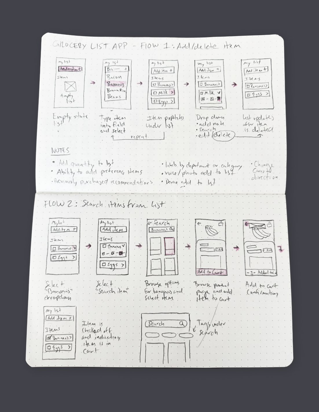
I then sketched out ideas to visualize concepts and built out user flows for each task. Once the flows were refined, I created prototypes for participants to click through each task.
CONTEXT
Imagine you just logged into an app where you can order groceries for delivery or pickup. You’ve navigated over to the grocery list and want to add items you need for the upcoming week.
Flow 1 – Add an item to your grocery list
There are multiple ways to complete this task, a user can add an item directly through search or select from a group of recommended items.
Flow 2 – Edit the name and quantity of an item on your list
The user clicks the edit icon in the dropdown to modify an item on the list. This action opens an overlay where they can adjust the item's name, size, and quantity.
Flow 3 – Find an item on your grocery list and add it to cart
The user can browse products from their grocery list by choosing a recommended item from the dropdown or searching related products.
Running the Usability Test
I ran the usability test on participants using the following method.
Preparing for the test
Wrote a detailed script ahead of time to guide the session
Performed a dry run with volunteer to ensure the script was clear
Ensured that all prototype tasks were working correctly
Running the test
Greeted participant and gave an overview of what to expect
Requested consent to record video, screen, and voice
Asked pre-test questions to understand participants' background
Guided participant through tasks in the app prototype
Asked post-test questions to gather impressions and suggestions
Analyzing results
Reviewed the recorded videos to observe user interactions
Measured task completion time, number of successes, and errors
Evaluated overall user satisfaction
Gathering Insights
I gathered insights using answers from a survey, pre-and-post-test questions, and video recordings. I measured task completion time, number of successes, and errors to determine effectiveness of design. Here are some key insights from watching the recordings and compiling data.
Survey results
Key USABILITY Findings
Here are some insights from watching the recordings and compiling data, this gave an understanding of how users interact with the app feature.
🔷 Flow 1 – Add an item to your grocery list
Users found this task to be easy and straight-forward, the majority of participants used the type field rather than selecting a recommended item.
🔷 Flow 2 – Edit the name and quantity of an item on your list
The majority of users completes this task, however some expected the checkbox to be the source of action rather than the dropdown.
🔷 Flow 3 – Find an item from your grocery list and add it to cart
All users completed this task, the majority added the item to cart by choosing a recommended product instead of searching.
Design Recommendations
Using the data, feedback, and insights from the recordings, I identified some test recommendations to improve the design.
Recommendation 01
Since some users found it difficult to find the edit button, add a label for each individual action at the bottom of the card.
Recommendation 02
Users expressed interest in having the ability to add an item directly to cart, having a button under product recommendations allows the user to skip the product page.
Recommendation 03
The purpose of the checkmark was unclear to some users, move selected items to a different section of the list and indicate when items are not in the cart.
Project Outcome
I was able to enhance my usability testing skills through this exercise. Next steps would include further testing, iteration, and implementation.


